- My personal website/
- Teaching Portfolio/
- Corporate strategy in a network perspective/
- Session 7 - Visualization/
Session 7 - Visualization

Table of Contents
Session 7 - Network visualization
This is the last session of this course. During this session, we will further sharpen your visualization skills using the ggraph package. We will cover topics such as adding graph attributes, scaling and tweaking network visualizations, modifying the legend, and adding a title. With the ggraph package, you will have a range of options to customize the visual output and create high-quality network visualizations in pdf format.
#setting the working directory
setwd("")

#loading the libraries
library(tidyverse)
library(data.table)
library(ggraph)
library(igraph)
library(graphlayouts)
# for cleaning functions in orbis
source("r/custom_functions.R")
library(purrr)
library(RColorBrewer)
library(readxl) # if error, then install.packages("readxl")
library(writexl) # if error, then install.packages("writexl")


# Subsetting den17 dataset by tags ----------------------------------------

# load data
den <- read_csv("input/den17-no-nordic-letters.csv")

# subset of corporations that have a valid cvr affiliation
den1 <-
  den %>% filter(sector %in% "Corporations")

# selecting finance tag
den2 <- has.tags(den1, c("Finance", "Banks", "Pensions"), result = "den")

# creating an incidence matrix
incidence <- xtabs(formula = ~ name + affiliation,
                   data = den2,
                   sparse = TRUE)

# adjacency matrix for chosing corporations
adj_c <- Matrix::t(incidence) %*% incidence

# one-mode graph for corporations
gr <- graph_from_adjacency_matrix(adj_c, mode = "undirected") %>%
  simplify(remove.multiple = TRUE, remove.loops = TRUE)

# quick visualization
autograph(gr)

# components & plotting ---------------------------------------------------

# What are the components?
complist <- components(gr)

# Decompose graph
comps <- decompose.graph(gr)

# Create an index
index <-
  table(complist$membership) %>%
  as_tibble(.name_repair = make.names) %>%
  arrange(desc(n)) %>%
  mutate(X = as.numeric(X)) %>%
  pull(1)

# Select the largest component
comp1 <- comps[[index[1]]]
7.1 Graph attributes
In the first part of this session we add some graph attributes that are later visualized. First, I am adding an attribute called firmtype and second, other node centrality attributes are added. Now, the has.tags() function is used to find a subset of the network based on affiliation. This function takes three arguments: the network data, the tag name, and the result type (i.e., whether to return the affiliation or the name of the nodes). This creates subsets of the den17 data set that are tagged with “Finance,” “Banks,” and “Pensions.”
###### 1. ADD SECTOR ######

# finding subset for only the biggest component
den3 <- den2 %>% filter(affiliation %in% V(comp1)$name)

# finding those with only a tag for finance, pension or banks
finance <- has.tags(den3, "Finance", result = "affil")
##         Matched positions
## Finance               558
##
##
bank <- has.tags(den3, "Banks", result = "affil")
##       Matched positions
## Banks               272
##
##
pension <- has.tags(den3, "Pensions", result = "affil")
##          Matched positions
## Pensions               180
##
##
Next, the rbind() function is used to combine these subsets into a single tibble with two columns: “name” and “tag.” Then, xtabs() is used to cross-tabulate the tibble into a sparse matrix format, which is then converted into a tibble format using the as_tibble() function.
# making a tibble
a1 <- rbind(
  tibble(name = finance, tag = "finance"),
  tibble(name = bank, tag = "bank"),
  tibble(name = pension, tag = "pension")
)

# cross tabulating
a2 <- xtabs(formula = ~ name + tag, data = a1, sparse = TRUE)

# change matrix to tibble format
a2 <- a2 %>% as.matrix() %>% as_tibble(rownames = "name")
Following this, the code uses a series of filter() and pull() functions to create separate vectors of firm names based on their sector (e.g., only_bank, only_finance, bank_finance, etc.). The NA firmtype attribute is added to the network using V(comp1)$firmtype <- NA. The firmtype attribute is then assigned to each node based on its name, using a series of which() statements and the <- operator.
# make vectors with different names depending on the possible firm types
only_bank <- a2 %>% filter(bank==1 & finance==0 & pension ==0) %>% pull(name)
only_finance <- a2 %>% filter(bank==0 & finance==1 & pension ==0) %>% pull(name)
only_pension <- a2 %>% filter(bank==0 & finance==0 & pension ==1) %>% pull(name)
bank_finance <- a2 %>% filter(bank==1 & finance==1 & pension ==0) %>% pull(name)
bank_pension <- a2 %>% filter(bank==1 & finance==0 & pension ==1) %>% pull(name)
finance_pension <- a2 %>% filter(bank==0 & finance==1 & pension ==1) %>% pull(name)
bank_finance_pension <- a2 %>% filter(bank==1 & finance==1 & pension ==1) %>% pull(name)

# make an empty network attribute
V(comp1)$firmtype <- NA

# rename for reach firm type
V(comp1)$firmtype[which(V(comp1)$name %in% only_bank)] <- "only_bank"
V(comp1)$firmtype[which(V(comp1)$name %in% only_finance)] <- "only_finance"
V(comp1)$firmtype[which(V(comp1)$name %in% only_pension)] <- "only_pension"
V(comp1)$firmtype[which(V(comp1)$name %in% bank_finance)] <- "bank_finance"
V(comp1)$firmtype[which(V(comp1)$name %in% bank_pension)] <- "bank_pension"
V(comp1)$firmtype[which(V(comp1)$name %in% finance_pension)] <- "finance_pension"
V(comp1)$firmtype[which(V(comp1)$name %in% bank_finance_pension)] <- "bank_finance_pension"

# Look at the result
V(comp1)$firmtype
##  [1] "only_finance"         "finance_pension"      "bank_finance"
##  [4] "only_pension"         "only_finance"         "bank_finance"
##  [7] "only_finance"         "finance_pension"      "only_finance"
## [10] "bank_finance"         "bank_finance"         "bank_finance"
## [13] "bank_finance"         "bank_finance"         "only_finance"
## [16] "bank_finance"         "only_pension"         "only_finance"
## [19] "finance_pension"      "bank_finance"         "bank_finance"
## [22] "bank_finance"         "bank_finance"         "only_finance"
## [25] "bank_finance"         "only_pension"         "finance_pension"
## [28] "bank_finance"         "finance_pension"      "only_finance"
## [31] "only_finance"         "bank_finance"         "bank_finance_pension"
## [34] "bank_finance"         "bank_finance"         "finance_pension"
## [37] "only_pension"         "finance_pension"      "finance_pension"
## [40] "only_finance"         "only_finance"         "only_finance"
## [43] "bank_finance"         "finance_pension"      "only_finance"
## [46] "only_finance"         "finance_pension"      "bank_finance"
## [49] "only_finance"         "bank_finance"         "bank_finance"
## [52] "bank_finance"         "bank_finance"         "bank_finance"
## [55] "bank_finance"         "only_finance"         "only_finance"
## [58] "bank_finance"
Second, the degree, betweenness and closeness centrality measures are calculated using the degree() betweenness() and closeness() functions, respectively. These centrality measures are then added to the network using the $ operator and assigned to each node based on its name.
###### 2. ADD CENTRALITY ######

# degree
V(comp1)$degree <- degree(comp1, mode = "all")

#betweenness
V(comp1)$betweenness <- betweenness(comp1, directed = FALSE)

# closeness
V(comp1)$closeness <-  closeness(comp1, mode = "all")
Now, we are ready to visualize these attributes.
7.2 Graph visualizations
In this section of the code, the graph attributes that were created earlier are used to visualize the network. The visualization is done using the ggraph package, which is a package for creating network visualizations in R.
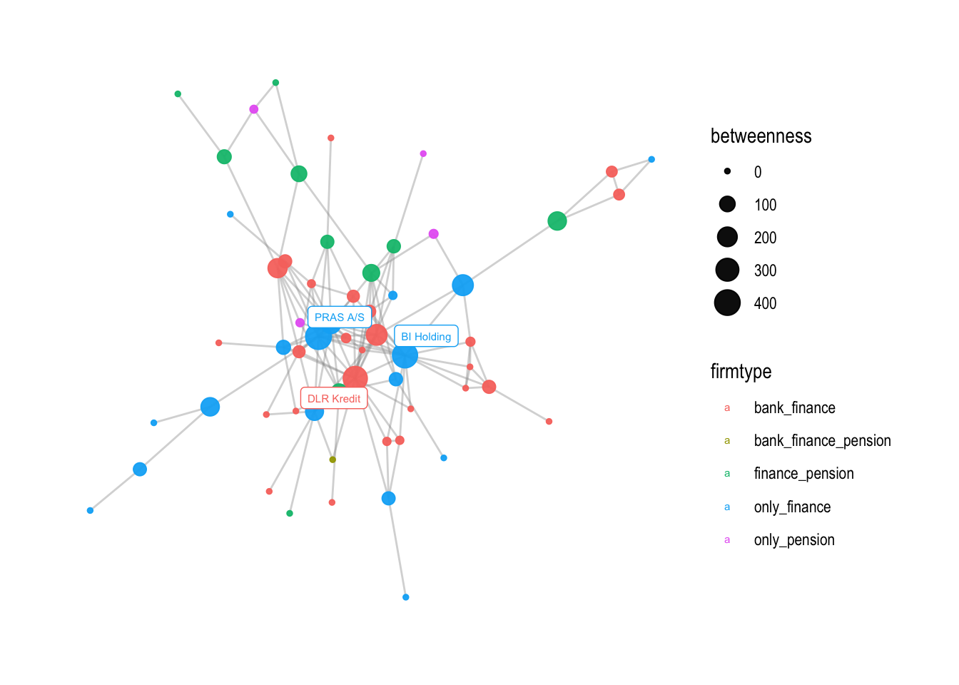
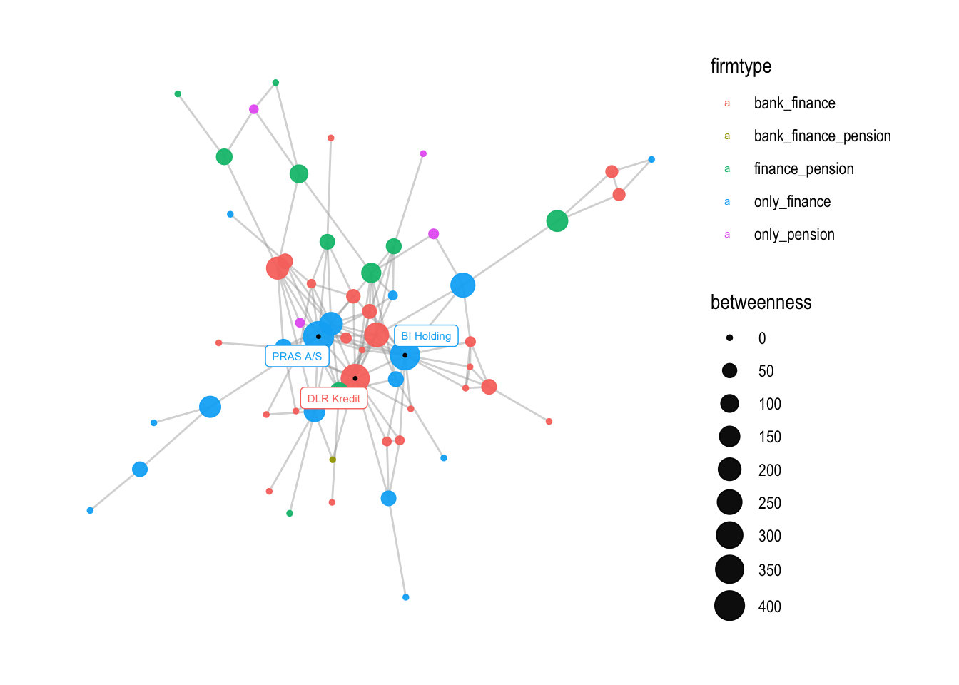
The first line of code creates a ggraph object with a Fruchterman-Reingold (fr) layout. This layout places nodes that are connected by edges close to each other and nodes that are not connected far from each other. The geom_edge_link0 function is used to draw the edges of the graph. The width argument sets the width of the edges and the alpha argument sets how visible the edges are.
Next, the geom_node_point function is used to draw the nodes of the graph. The color aesthetic is set to firmtype, which was defined earlier as a graph attribute that categorizes each node based on the type of firm it represents. The size aesthetic is set to betweenness, which was also defined earlier as a graph attribute that measures the importance of each node based on how many shortest paths between other nodes it lies on. The alpha argument sets the transparency of the nodes.
The geom_node_label function is used to add labels to the nodes. The filter argument selects only nodes with a betweenness value greater than 250. The color aesthetic is set to firmtype, which categorizes the nodes. The label aesthetic is set to name, which is the name of each node. The size argument sets the font size of the labels, and the repel argument sets whether or not the labels should overlap with each other.
Finally, the theme_graph function is used to apply a theme to the visualization.
# visualization with node color as firmtype and node size as degree
v1 <- comp1 %>%
  ggraph(
    #layout could be one of the above
    layout = "fr") +
  geom_edge_link0(
    # width of the line
    width=0.5,
    # how visible the line is (from 0-1)
    alpha=0.4,
    color = "grey60") +
  geom_node_point(
    # different for every node
    aes(color=firmtype, size = betweenness),
    alpha = 0.95) +
  geom_node_label(
    aes(filter=betweenness>250, color=firmtype, label=name),
    size=2,
    repel=TRUE) +
  theme_graph()

v1
## Warning: Using the `size` aesthetic in this geom was deprecated in ggplot2 3.4.0.
## ℹ Please use `linewidth` in the `default_aes` field and elsewhere instead.
## This warning is displayed once every 8 hours.
## Call `lifecycle::last_lifecycle_warnings()` to see where this warning was
## generated.
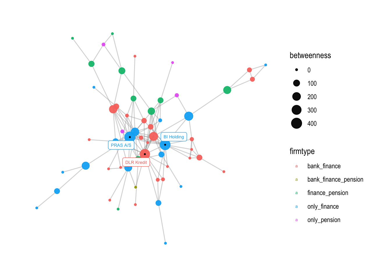
In the next section of the code, v2 is created by adding a small black dot to the location of the labeled nodes using geom_node_point. This helps to make the labeled nodes more visible.
v2 <- v1 +
  # add a little dark point to where the labelled nodes are
  geom_node_point(aes(filter=betweenness>250), color = "black", size =0.5)

v2
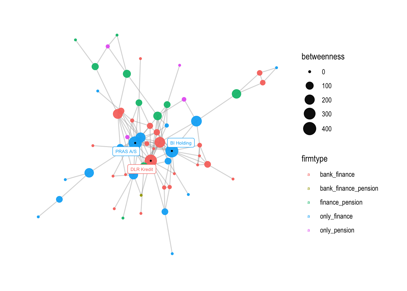
v3 shows how the range of the node sizes can be changed using scale_size_continuous. The range argument sets the minimum and maximum node sizes. In this case, the minimum size is set to 1 and the maximum size is set to 7. The breaks argument sets the values at which ticks are placed on the legend for the node size. In this case, ticks are placed at intervals of 50 between 0 and 400.
# if you want to change the size range of nodes, you can use this command
v3 <- v2 + scale_size_continuous(range = c(1,7))

v3
# you can also change the breaks
v3 + scale_size_continuous(range = c(1,7),
                           breaks = c(0,50,100,150,200,250,300,350,400))
## Scale for size is already present.
## Adding another scale for size, which will replace the existing scale.
If you want, you can also change the size of the legend with the following command:
# changing the size of the firmtype points in the legend
v3 + guides(color = guide_legend(override.aes = list(size = 3)))

The next step is to change the names on the legend. This can be achieved using the labs() function, which is used to modify the titles and axis labels of a plot. In this case, we change the size and color legend titles to “Betweenness centrality” and “Firmtype”, respectively:
# change the names on the legend
v4 <- v3 + labs(
  size="Betweenness centrality",
  color="Firmtype")

v4
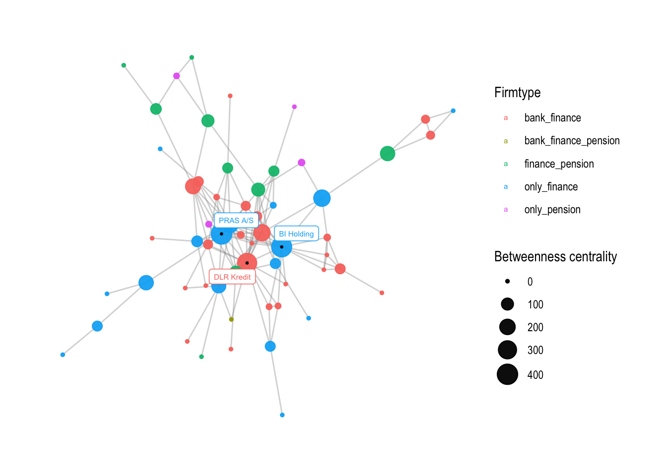
The resulting plot v4 will have modified legend titles.
Next, we change legend names and adapt colors, choosing a different color palette. To retrieve a specific color scheme, we can use the display.brewer.all() function to view a list of color palettes available. Here, we use the “Paired” palette from the RColorBrewer package, which contains 12 distinct colors. Since there are five unique firmtype values in our data, we need to generate five colors from the palette.
This can be achieved using the colorRampPalette() function:
# choosing different color palette
number <- V(comp1)$firmtype %>% unique() %>% length()

# To retrieve a specific color sheme:
display.brewer.all()
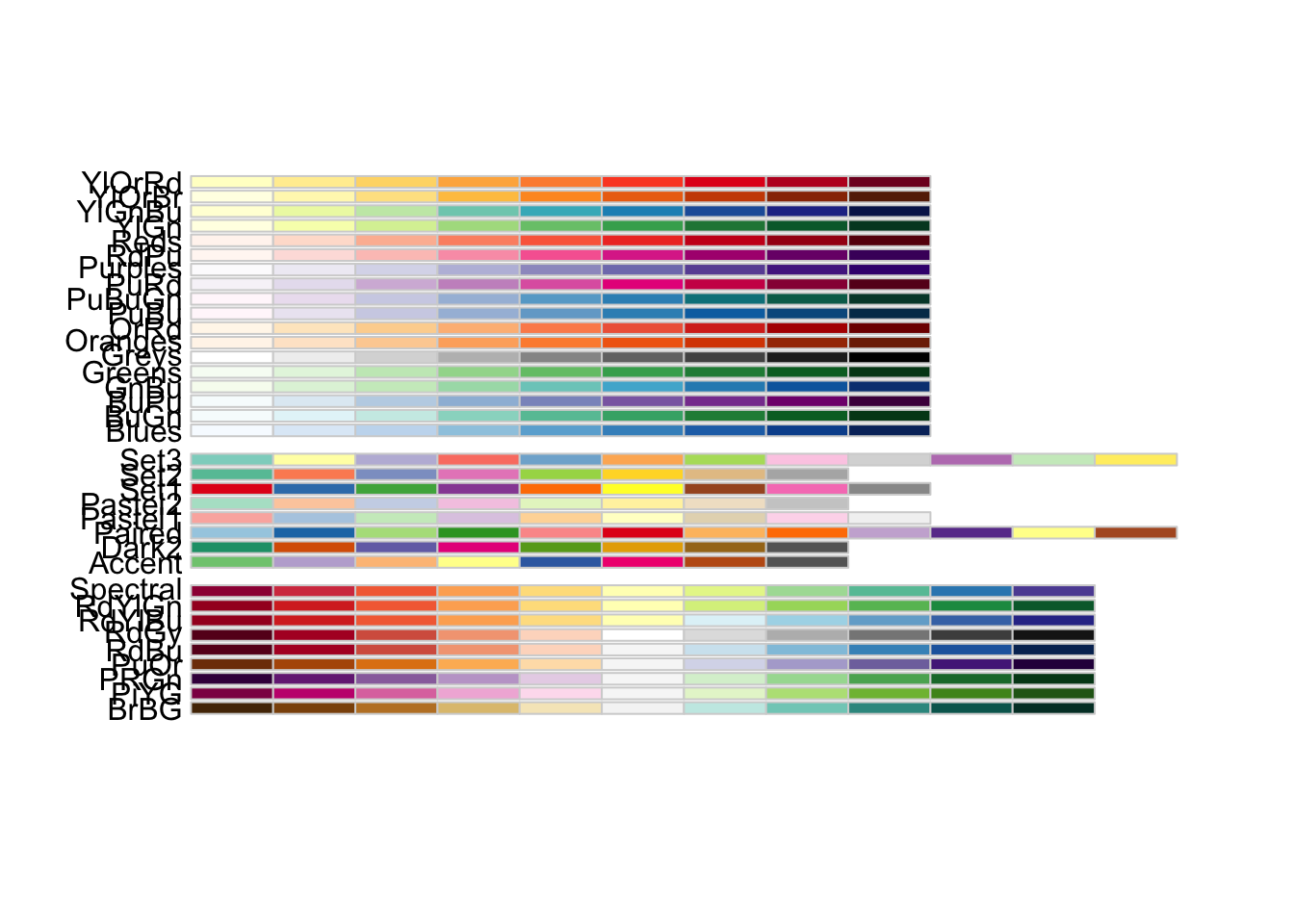
my_colors <- colorRampPalette(brewer.pal(12, name = "Paired"))(number)
The resulting my_colors vector will contain five colors generated from the “Paired” palette.
We can then apply these colors to the plot using the scale_color_manual() function, which allows us to manually set the colors of legend values. We also specify the breaks and labels for each firmtype value using the breaks and labels arguments:
# change not only the values, but also the labels
v5 <- v4 +
  scale_color_manual(values = my_colors,
                     breaks=c('only_finance', 'only_pension', 'bank_finance', 'finance_pension', 'bank_finance_pension'),
                     labels=c('Finance', 'Pension', 'Bank & Pension', 'Finance og Pension', 'Bank, Finance\n& Pension'))

v5
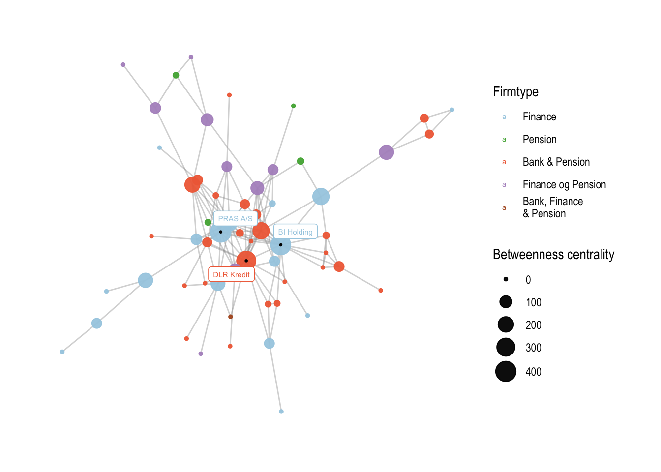
The resulting plot v5 will have modified legend values with custom colors and labels.
Finally, we add a title and a subtitle to the plot using the labs() function:
# add a title and a subtitle
v6 <- v5 + labs(title = "Figure 1: Corporate interlocks in the financial industry",
                subtitle = "Something")

v6
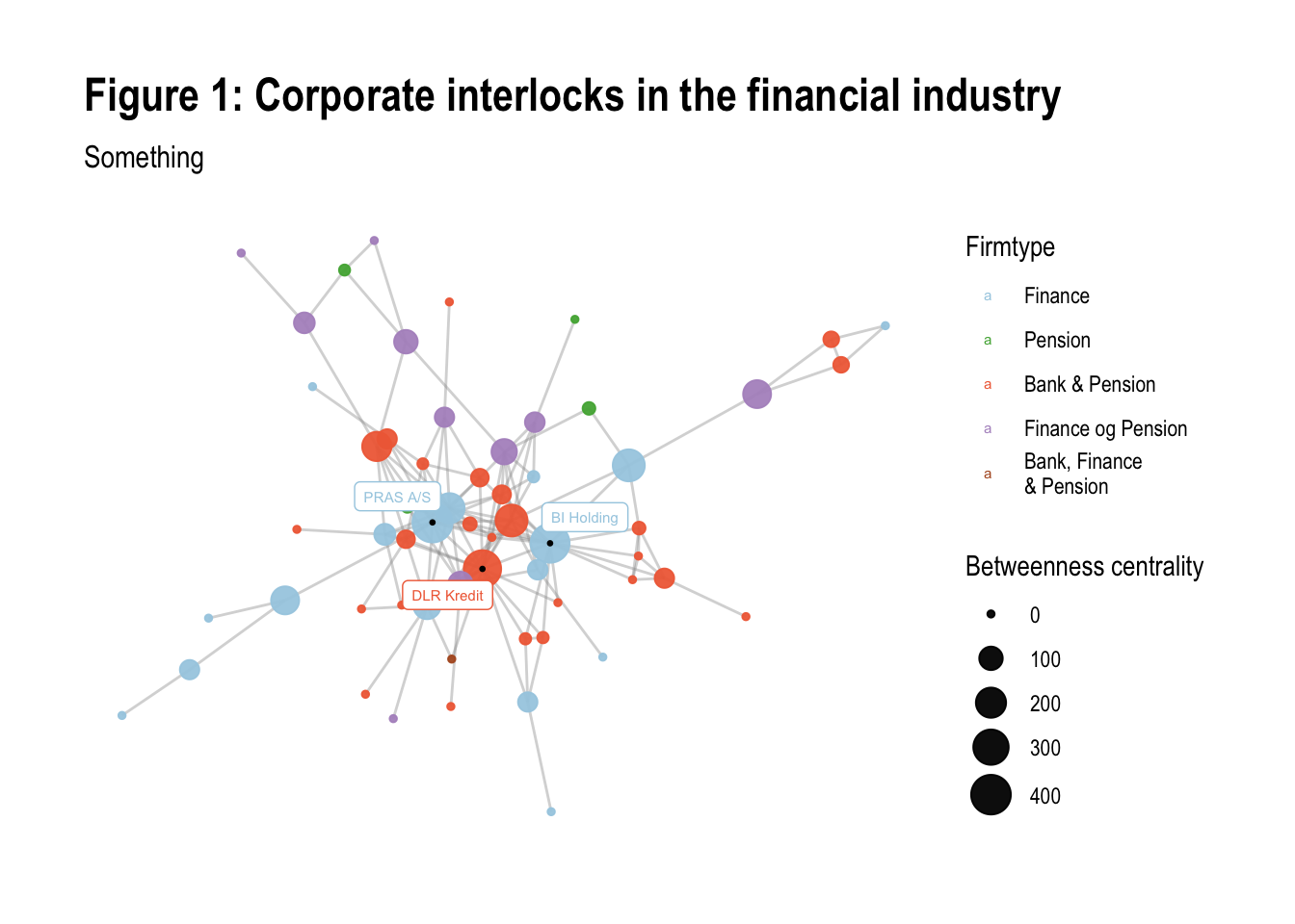
The resulting plot v6 will have a title and a subtitle.
A second example
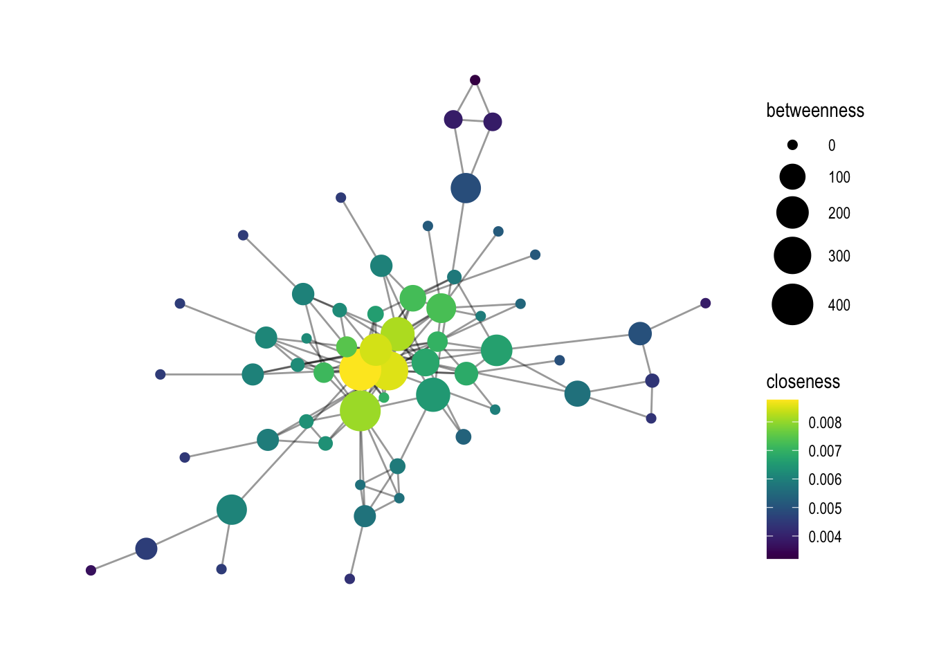
In this part of the code, the focus is on creating a graph that visualizes the relationship between nodes based on two different centrality measures: closeness and betweenness.
The first step is to create a base graph using the comp1 data frame and the ggraph function. This time, the layout parameter is set to “graphopt”, which means that the graph is generated using a force-directed layout algorithm that tries to minimize the overlap between nodes and edges.
Next, the geom_edge_link0 function is used to draw the edges between the nodes. The width and alpha parameters control the thickness and transparency of the edges, respectively.
The geom_node_point function is used to draw the nodes. The color parameter is set to closeness, which means that the nodes are colored based on their closeness centrality scores. The size parameter is set to betweenness, which means that the size of the nodes is proportional to their betweenness centrality scores.
# Another example with closeness (and a gradient measure)

# base graph
p1 <- comp1 %>%
  ggraph(layout = "graphopt") +
  geom_edge_link0(width=.5, alpha=0.4) +
  geom_node_point(aes(color=closeness, size=betweenness)) +
  theme_graph()
After setting the base graph, the scale_size_continuous function is used to adjust the size range of the nodes. In this case, the nodes are scaled to a range of 2 to 10.
# adding a size scalling argument
p1 <-  p1 + scale_size_continuous(range=c(2, 10))
The next step is to change the gradient color of the nodes. Two options are shown: scale_color_viridis and scale_color_gradient2. scale_color_viridis is a function that provides a pre-defined gradient color scheme called “viridis”. scale_color_gradient2 allows you to create your own gradient color scheme by specifying the low, mid, and high colors.
# changing the gradient color: viridis is a good option
p1 + scale_color_viridis()
# otherwise create it yourself, colors can be chosen by looking at colors()
p1 + scale_color_gradient2(low='white', mid='wheat',  high='mediumvioletred', na.value='green')
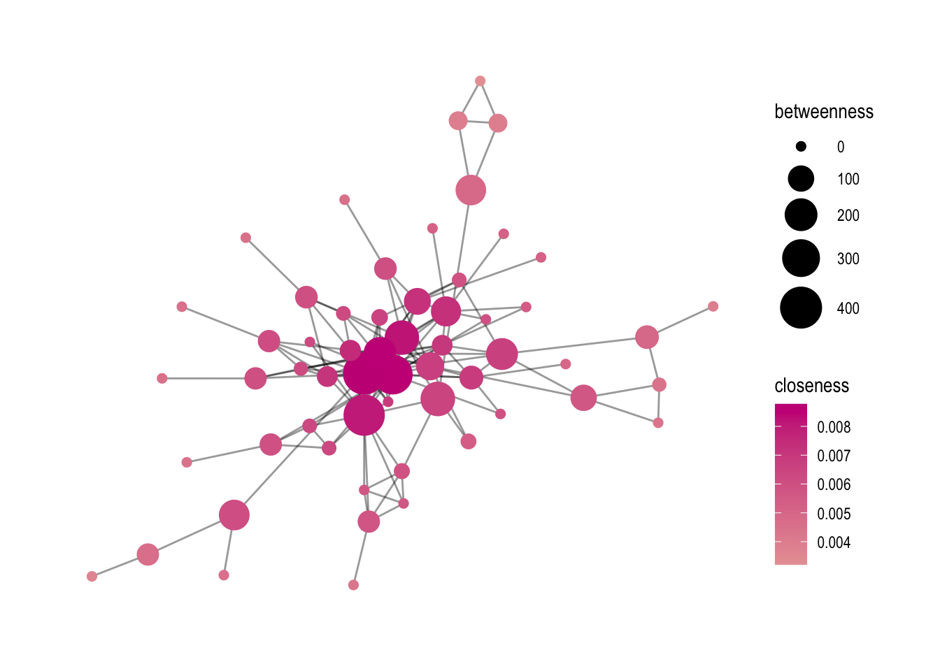
Finally, the ggsave function is used to save the graph as a PNG file. The parameters specify the name of the output file, the plot object (p1), and the dimensions of the plot in centimeters.
# save as png or as pdf
ggsave('output/elitedb-graph-lektion06_01.png', plot = p1, width=30, height=17.5, unit='cm')
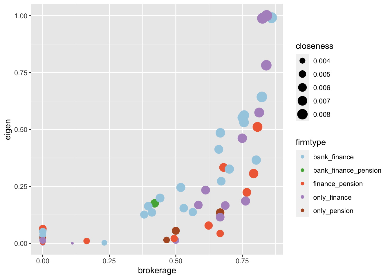
7.3 Analysis of centrality measures using ggplot2
Sometimes, it can be useful to further analyse the association between centrality measures. Here, I am showing two options on how to analyze their interaction.
First, I create a data frame called metrics using the tibble() function. This data frame contains various centrality measures for the nodes in the graph, such as degree, betweenness, closeness, eigen centrality, and brokerage. These measures are calculated using functions such as degree(), betweenness(), closeness(), eigen_centrality(), and constraint().
metrics <- tibble(
  name = names(degree(comp1, mode="all")),
  degree =        degree(comp1, mode="all"),
  betweenness =   betweenness(comp1, directed=FALSE, weights=NA),
  closeness =     closeness(comp1, mode="all", weights=NA),
  eigen =         eigen_centrality(comp1, directed=FALSE, weights=NA)$vector,
  brokerage= 1-constraint(comp1)
)
In the data frame, I also want to include a column called firmtype, which will be used to categorize the nodes in the graph by their business type. To create this column, a vector called list1 is defined that contains the names of various business types, such as “only_bank” and “bank_pension”. The metrics data frame is then updated using a for loop that assigns each node in the graph to its corresponding business type based on the node’s name.
#create a column with firmtypes
list1 <- c("only_bank", "only_finance", "only_pension", "bank_finance", "bank_pension", "finance_pension", "bank_finance_pension")

# make an empty column called firmtype
metrics$firmtype <- NA

# loop through list1 and rename NAs with names in list1 by their location.
for(i in list1) {

  metrics$firmtype[which(metrics$name %in% get(i))] <- i

}
After creating the metrics data frame, two visualization options are provided using ggplot2.
- Option 1: A scatter plot of the “brokerage” centrality measure on the x-axis and the “eigen” centrality measure on the y-axis, with the size of the points representing the “closeness” centrality measure and the color of the points representing the “firmtype”.
# What can you visualize: Option 1
metrics %>%
ggplot(aes(x = brokerage, y = eigen, color=firmtype, size=closeness)) +
  geom_point() +
  scale_color_manual(values=my_colors)
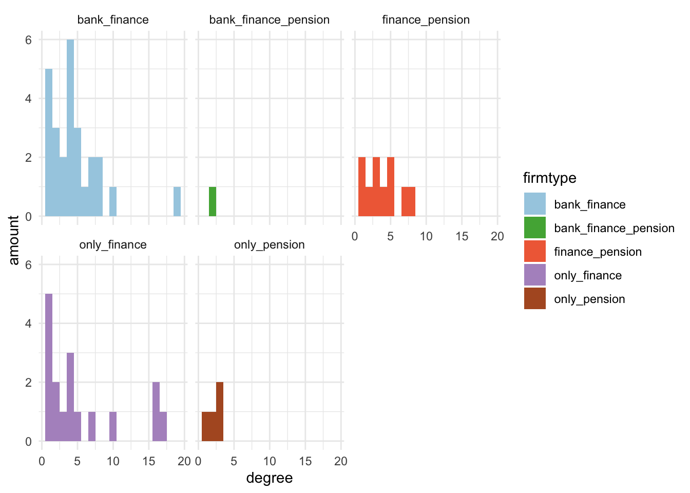
- Option 2: A histogram of the “degree” centrality measure for each firm type, with each firm type represented by a different colored bar. The facet_wrap function allows us to separate the histograms by firm type.
# Option2
metrics %>%
ggplot(aes(x = degree, fill=firmtype)) + geom_histogram(binwidth=1) +
  labs(y='amount') +
  theme_minimal() +
  facet_wrap(~firmtype) +
  scale_fill_manual(values=my_colors)